Customer case: WCAG audits and accessibility trainings for a global bank
Customer
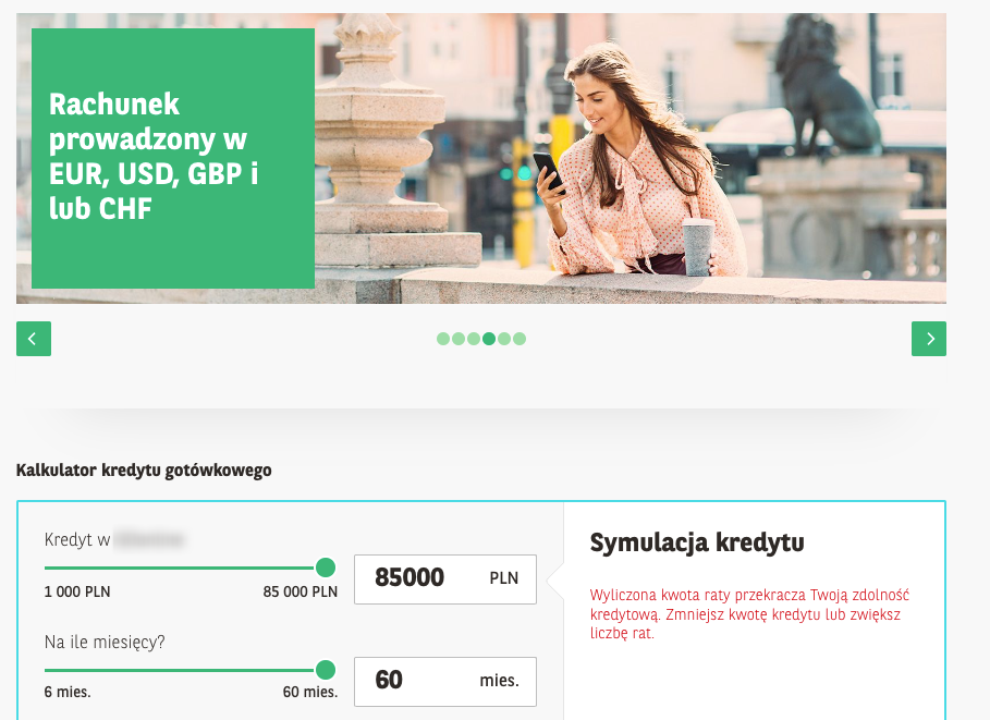
One of the largest banks in Poland, serving individual and business customers
Project
Web and mobile application audits, accessibility training, system design consultation
Date
December 2022 - September 2023
Team
Dawid Górny, Kacper Mikocki, Tomasz Bonior, Dariusz Drezno
Comments from a questionnaire completed by trainees:
“Very professional training with a lot of knowledge.
A very eye-opening training! It touches on a matter in which most of us have no understanding and do not live in it every day (at least for now :)). Accessibility in accordance with WCAG guidelines allows everyone to benefit from banking, as all of us may have worse eyesight in our old age. The training perfectly demonstrated what a website created without WCAG in mind means for a visually impaired person.
Certainly for people who have not been exposed to it, this is an eye-opener, showing how important and necessary it is to work on accessibility...“
Challenge
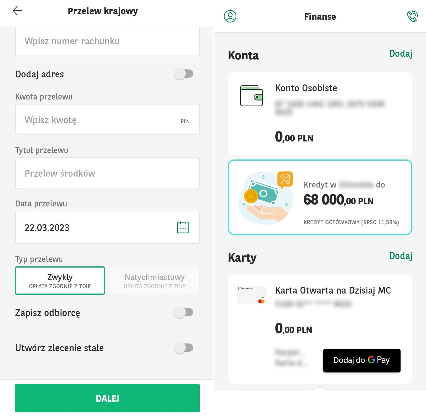
As in many other banks, the team we worked with was responsible for the creation, development and maintenance of several different systems: a web and mobile application for individual customers and an corporate banking application.
The basic knowledge of accessibility and its importance was already within the organization, but the next steps were needed: Objectively assessing the accessibility of already existing solutions, and acquiring basic skills in designing, programming and testing accessible applications.
The retail banking sector, along with e-commerce, telecommunications and transportation, is also preparing for the implementation of the European Accessibility Act (EAA) in mid-2025.
Solution
The project involved multiple teams developing two web applications and one mobile app. Together, we divided it into three main stages:
web and mobile application accessibility training for UX designers, developers and testers
testing the accessibility of the applications they develop and adding the problems found to JIRA
consultations of system design created in Figma by UX team
Since team members work remotely, we conducted trainings and consultations online.
Trainings
We conducted a total of 13 training sessions, based on examples from applications developed by the participants. The range of topics covered was based on the agenda from our standard offer.
The two-hour meetings on the Teams platform were attended by dozens of people from UX, testing, software development and product management. The number of people at each session was selected so that everyone had space and time to ask questions and lead discussions.
WCAG audits
We performed audits of three applications, two web and one mobile. The tests revealed at least dozens of problems for each application. We reported all the findings using the client's JIRA system.
With this approach, team members already familiar with the most common accessibility problems and their solutions were able to work more effectively on fixing the requests found during the audit.
We started the audits by selecting the scope to detect recurring problems for many screens, but also bugs that may only occur in a particular place in the system. For the selected scope, testing was carried out by both a technical accessibility tester assessing the application's compliance with WCAG 2.1 requirements at the AA level and a blind tester reporting on application usability (UX) issues in addition to typical accessibility errors.
UX consultations
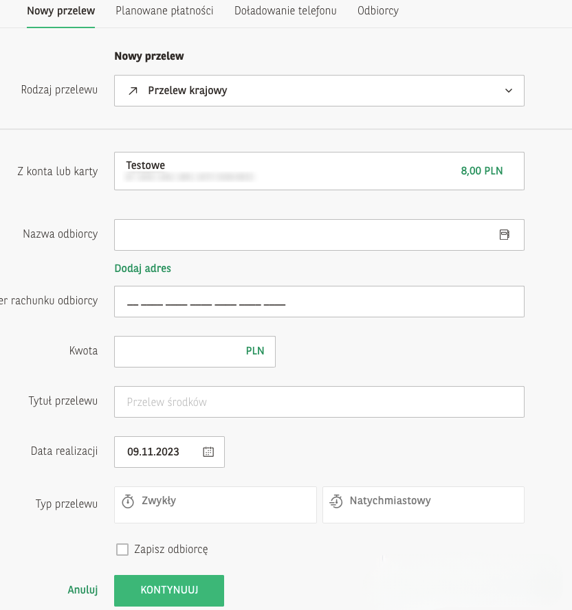
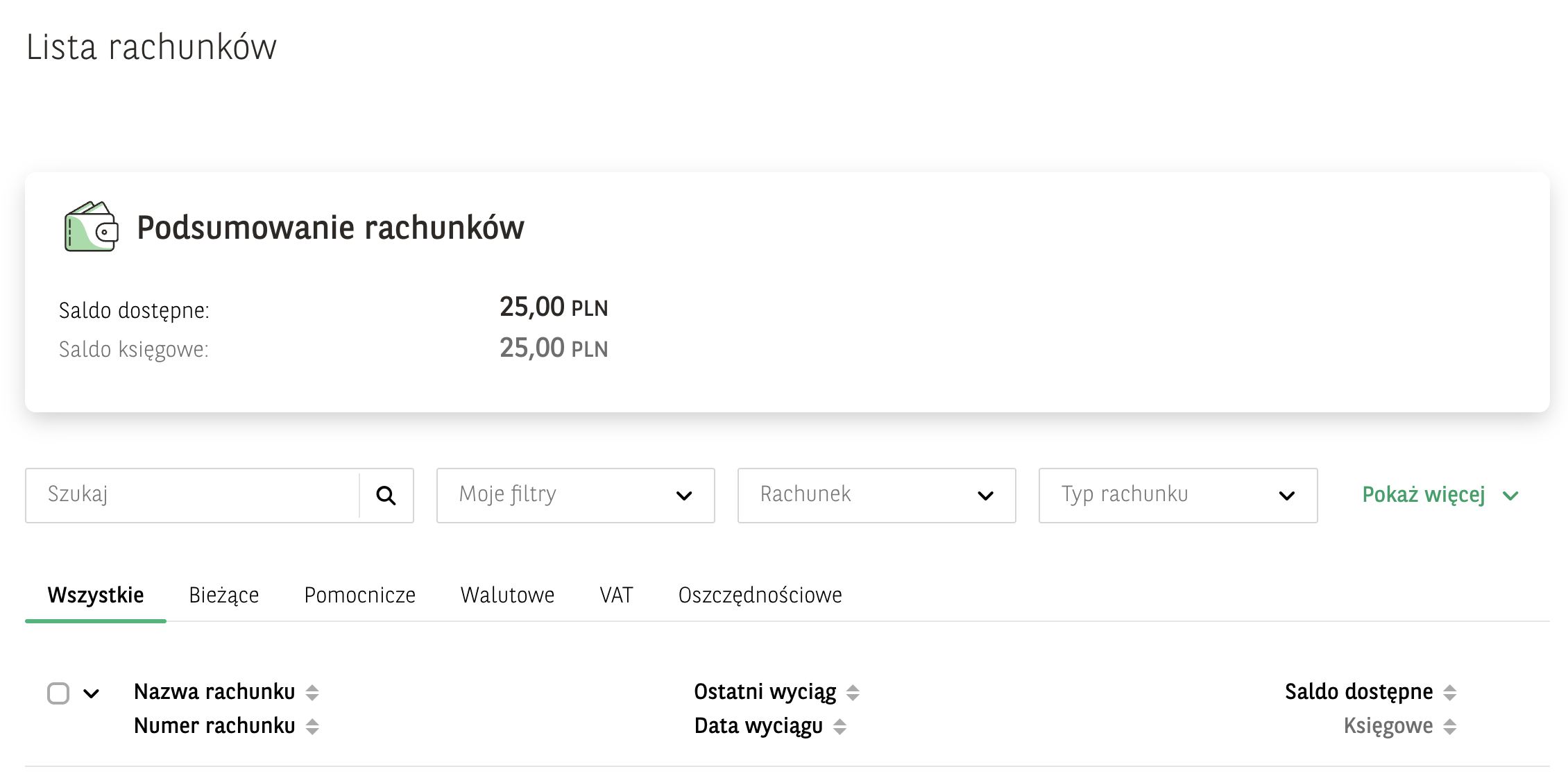
During dozens of hours of consultations, we discussed ways in which accessibility can be ensured and the usability of many components that can be used in new versions of the system can be improved. These took the form of one-and-a-half hour online sessions involving a blind user, a technical accessibility specialist, and members of the UX team and front-end developers. These consultations were designed to introduce accessibility at an early stage of solution development ("shift left"), thus eliminating many accessibility issues that are expensive and time-consuming to correct at later stages. During each session, we discussed the components presented in Figma, answered questions about accessibility bugs associated with them, and discussed best practices to increase usability for people with disabilities.
The involvement of the actual end-user as well as someone involved in the technical side of accessibility made it possible to discuss all topics comprehensively and from different perspectives.
Continuous development of the accessible design system reduces the risk of new accessibility problems when updating each application.
Results
We are continuing our cooperation and have already planned audits of the bank's next digital services. Our joint work on the design system, which is gradually becoming more accessible, is also underway.
We conducted a presentation of the activities to date for the bank's entire digital transformation department, and recorded a demonstration video, which is used in the bank's internal communications, globally.
We will also take active part in the "Accessibility Day" - an event organized for all bank employees.
All these activities translate into improved accessibility of the bank's products and services and help promote accessibility within the organization.

Kacper Mikocki
Co-founder of Accens, responsible for the area of testing and training
Specialises in technical aspects of digital accessibility, has completed several dozen accessibility testing projects and WCAG audits. Leads accessibility courses and develops additional training materials. Software tester, webmaster and digital accessibility consultant. Certified IAAP Web Accessibility Specialist (WAS).
Are you considering a WCAG audit of your application? Looking for accessibility training?
Check out the details of our WCAG audit offerings or just contact us and let's talk.
We organize accessibility training open to everyone and for closed groups. We address special training needs too.
